

Top 5 Exterior Paint Colors for 2025: Stay on Trend and Stand Out
Give your home a refresh that reflects the future of design.
Give your home a refresh that reflects where design is headed.
If your home’s exterior is starting to look dated, faded, or harder to maintain, 2025 offers a clear direction: warmer colors, softer undertones, and nature-inspired choices that feel current without trying too hard. Sherwin-Williams’ 2025 Colormix Forecast leans into subtle neutrals, turned earth, and narrative-rich shades. Benjamin Moore’s Color Trends 2025 centers on foundational colors that bring warmth, comfort, and a sense of ease. Houzz reported that design pros are increasingly seeing terra-cotta, taupe, dusty blue, muted sage, and olive green across 2025 projects. Pantone’s 2025 selection, Mocha Mousse, adds even more evidence that brown-based warmth and comfort are shaping the larger color conversation.
For homeowners, that means exterior colors with better staying power and curb appeal that still feel livable years from now. For property managers, it means finishes that photograph well online, appeal to a broad audience, and help homes and residential properties look updated and well cared for from the first glance. Exterior appearance matters: the National Association of Realtors says 92% of REALTORS® recommend curb-appeal improvements before listing, and Zillow notes that neutral and earthy exterior paint colors appeal to the broadest group of buyers.
What ties the strongest 2025 color directions together is balance. Even the bolder options are softened by gray, brown, or green undertones, which makes them easier to live with on a full exterior. That matters for residential painting services because exterior color is rarely just about trend. It is about how a home reads from the street, how it looks in listing photos, how it works with roofing and landscaping, and how long it will still feel current after the project is complete. The best exterior palettes give a property personality without locking it into a short-lived look.
1. Warm Earthy Clay
Clay tones sit in that sweet spot between beige, taupe, and terracotta. They feel grounded, inviting, and upscale without feeling too dark or too trendy. Sherwin-Williams’ 2025 forecast describes one of its palettes with phrases like subtle neutrals, sifting sands, and turned earth, and includes shades such as Mexican Sand, Studio Clay, and Grounded. Those are exactly the kinds of clay-forward colors that work beautifully on siding, stucco, fiber cement, and homes with stone or brick accents.
For homeowners, warm earthy clay softens hard lines and helps natural textures stand out. For property managers, it is a smart choice when you want a home to feel designed and elevated while still maintaining broad appeal. It works especially well with creamy off-white trim, dark bronze lighting, and a medium wood stain or black front door. If the home gets a lot of shade, going slightly lighter in the clay family can help the exterior stay warm and welcoming instead of reading muddy. Benjamin Moore’s guidance on white also supports pairing warmer whites with deeper, richer hues for contrast and definition.
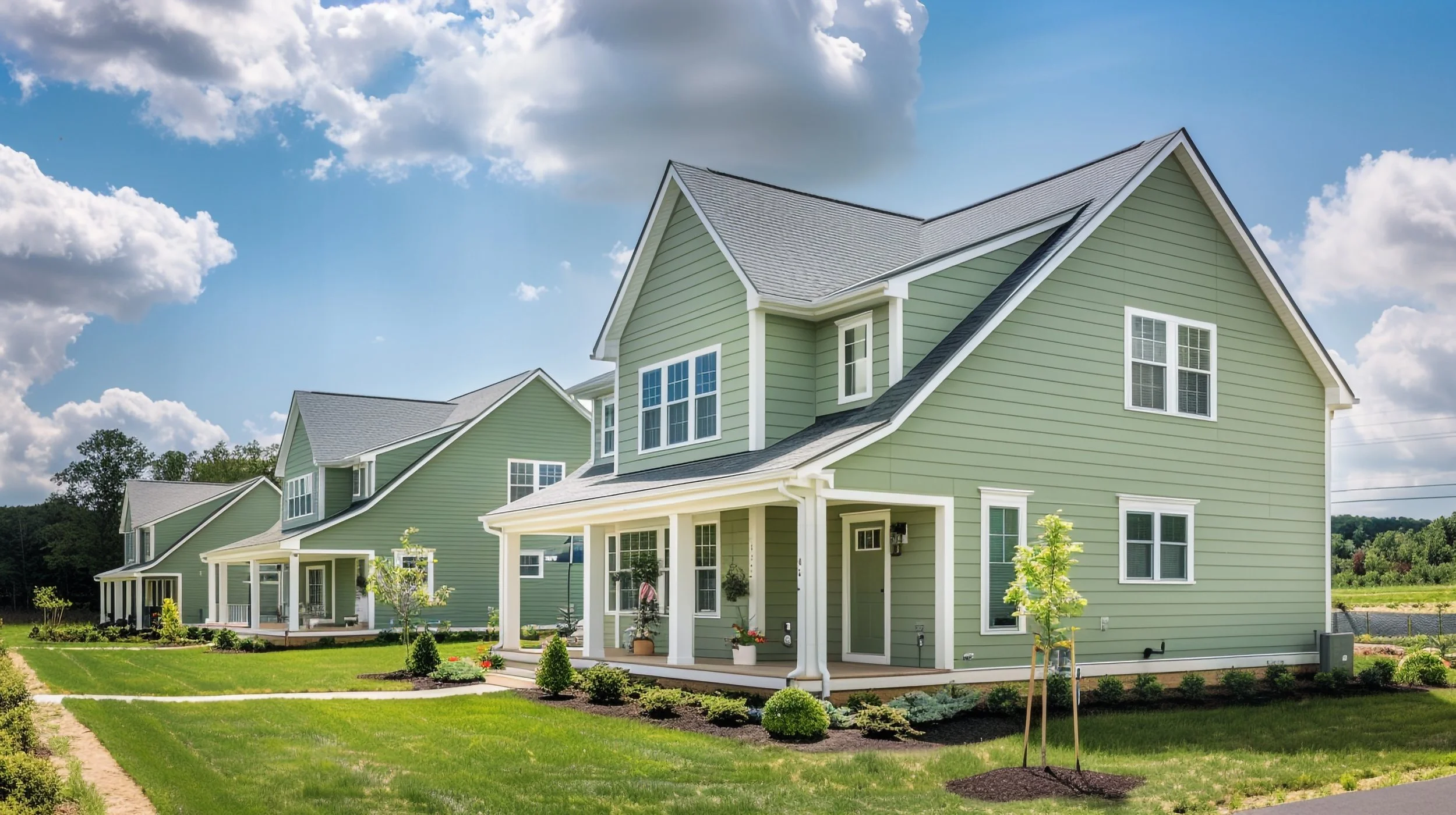
2. Muted Sage Green
If you want color without going too bold, muted sage green is one of the safest and most stylish ways to do it. Houzz says pros are seeing muted sage and olive gain traction, and Benjamin Moore’s 2025 palette includes greens such as Ashwood Moss and Rosepine. Benjamin Moore’s exterior guidance also notes that green exterior colors blend homes with nature, boost harmony, and enhance curb appeal, which helps explain why this family feels so right for 2025.
Muted sage works especially well on cottages, ranch homes, older houses with mature landscaping, and residential properties where you want personality without sacrificing future resale or rental appeal. It pairs easily with white, sand, taupe, and natural wood, so it is a flexible option for shutters, railings, porch ceilings, trim, and entry doors. Crisp white trim keeps it clean and fresh, while warm wood, copper, or black accents can make the whole palette feel more custom. If the property is surrounded by greenery, sage often feels especially natural because it visually connects the house to the landscape instead of fighting it.
3. Desert Terracotta
Terracotta continues to earn attention because it feels both timeless and fresh. Houzz points to rich, earthy palettes including terra cotta as a defining design direction in 2025, and Sherwin-Williams’ Wellspring palette speaks directly to shared heritage, connectedness to the land, and narrative-rich colors. Pantone’s Mocha Mousse reinforces that same broader move toward warm, grounded browns and earthy comfort. Taken together, those sources point clearly toward desert terracotta and sunbaked clay tones as strong exterior directions for homes that want warmth and depth.
This is a particularly strong choice for Mediterranean, Spanish-inspired, cottage, coastal, and transitional homes, but it can also be used more selectively if a full-body terracotta exterior feels like too much. A front door, porch floor, shutters, or architectural accent in a desert terracotta tone can give a home character without overwhelming the rest of the palette. For homeowners, it creates warmth and individuality. For property managers, it is a great way to add memorable curb appeal in measured ways. Pair it with cream, warm sand, or soft white trim, then finish with matte black hardware if you want the look to lean a little more modern.
4. Soft, Warm White
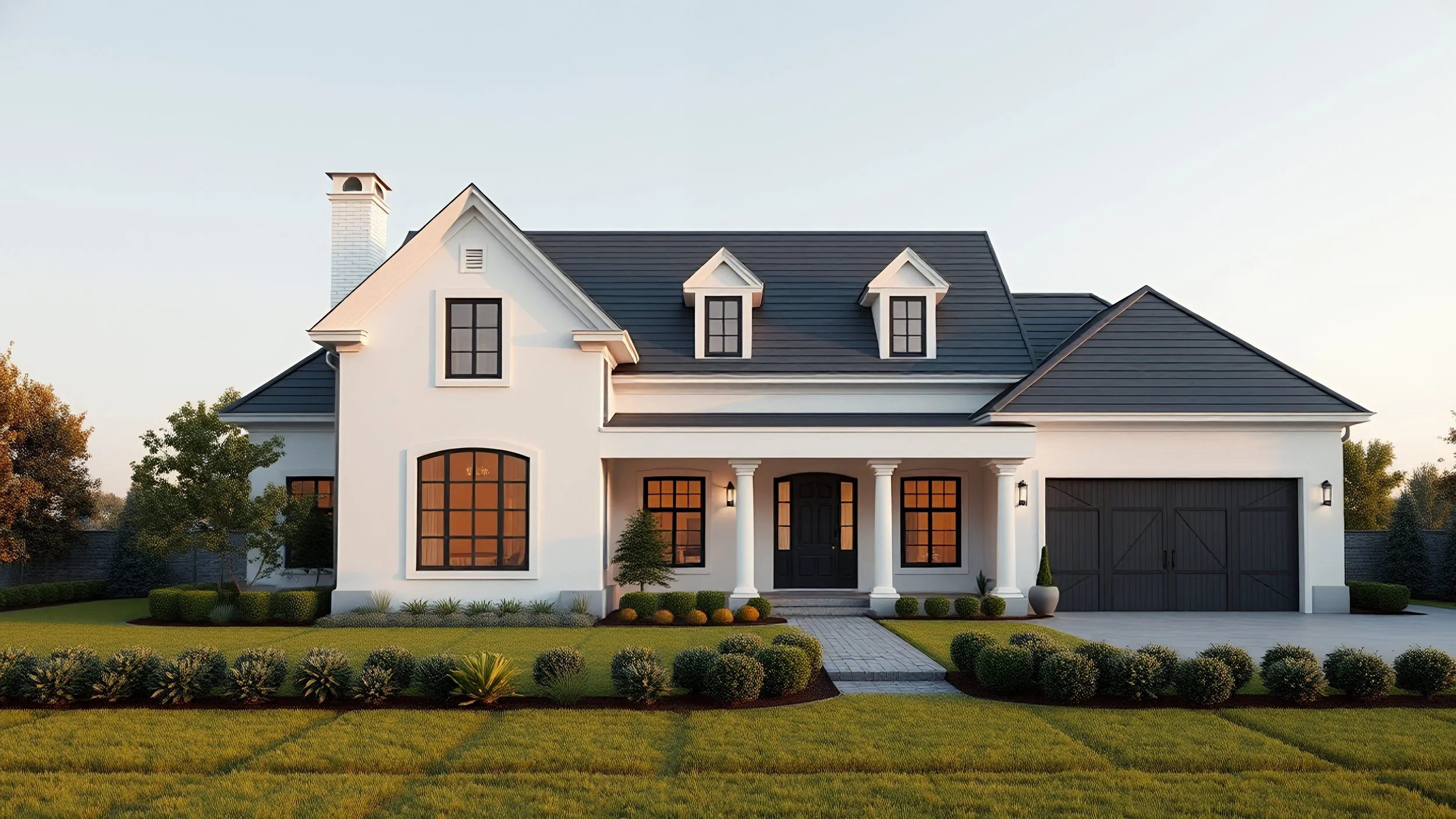
Why It’s Trending:
White exteriors are not going anywhere, but the crisp, icy versions are making room for warmer whites that feel softer and more inviting. Benjamin Moore notes that warm whites have undertones of red, orange, and yellow, which create a soft glow and an inviting atmosphere, and it still counts White Dove among its most popular exterior whites. Sherwin-Williams’ 2025 Wellspring palette also includes Oyster White, which reinforces the move toward warmer story-rich neutrals rather than stark contrast.
Soft warm white is a strong choice if you want a property to look clean, current, and broadly appealing. It works for homeowners who want timelessness, and it also works for property managers getting a home ready for sale or lease because it reads polished in listing photos and adapts to nearly every architectural style. The key is to keep it from looking flat. Layer in greige, taupe, or a slightly deeper trim color, then add a contrasting front door in charcoal blue, olive, bronze, or rich wood stain. Benjamin Moore specifically recommends pairing white with richer hues or layering multiple whites to create subtle dimension.
5. Bold Charcoal Blue

If you want something dramatic but still classic, charcoal blue is one of the strongest dark exterior options in the 2025 conversation. Sherwin-Williams says dark blue colors are a popular choice for home exteriors, with shades like Rainstorm carrying a slate-gray undertone. Benjamin Moore says dark, dramatic exteriors have become an ongoing mainstay rather than a passing trend, and Houzz includes dusty blue among the warm earthy palettes pros continue to see across current homes.
Charcoal blue works especially well on Cape Cod, colonial, craftsman, and contemporary homes. It delivers contrast, depth, and a finished look that feels elevated in person and in photos. For homeowners, it is a great way to move beyond flat gray without stepping into something flashy. For property managers, it can help a home stand out in a crowded market while still feeling sophisticated and broadly acceptable. Pair it with creamy or crisp white trim, natural wood, and matte black or brushed metal fixtures. Just make sure to sample it carefully in direct sun, because dark blues can swing more navy or more black depending on the light.
Tips for Choosing Your Perfect 2025 Exterior Color
The best color on paper is not always the best color on your house, which is why sampling matters so much. Benjamin Moore recommends building an exterior palette around the design elements of your home, its architectural style, surroundings, and natural light. It also recommends painting brush-on samples onto white foam board, taking them outside, and observing them throughout the day rather than relying only on online swatches. Sherwin-Williams likewise emphasizes color chips, peel-and-stick options, and Color To Go® samples so homeowners can see how colors behave in the actual environment.
If you are a homeowner, start with what is already there: roofing, brick, stone, landscaping, walkways, and trim details. If you are a property manager, think one step further and ask whether the palette will still feel right across multiple seasons, whether it supports broad resale or rental appeal, and whether future touch-ups will be easy to manage. Zillow’s exterior-upgrade guidance is useful here too, because it notes that neutral and earthy shades appeal to a wider group of buyers. That does not mean you have to play it safe all the time, but it does mean you should choose boldness thoughtfully.
If you manage several homes or oversee residential turnovers, consistency matters as well. A thoughtful exterior palette can make routine maintenance easier, create a more professional presentation across properties, and reduce the temptation to chase color trends that will feel dated too quickly. The goal is not to make every home look the same. It is to choose colors that feel elevated, durable, and easy to market while still giving each property its own identity.
Trim and accents matter just as much as the main body color. Benjamin Moore notes that homeowners typically use about three to four different paint colors on an exterior when trim, railings, shutters, front doors, porches, and decks are included. That means the smartest choice is usually not one perfect wall color by itself, but a complete palette where siding, trim, and focal points all support one another. In many cases, the biggest curb-appeal win comes from choosing a more thoughtful combination rather than making the whole house dramatically darker or brighter.
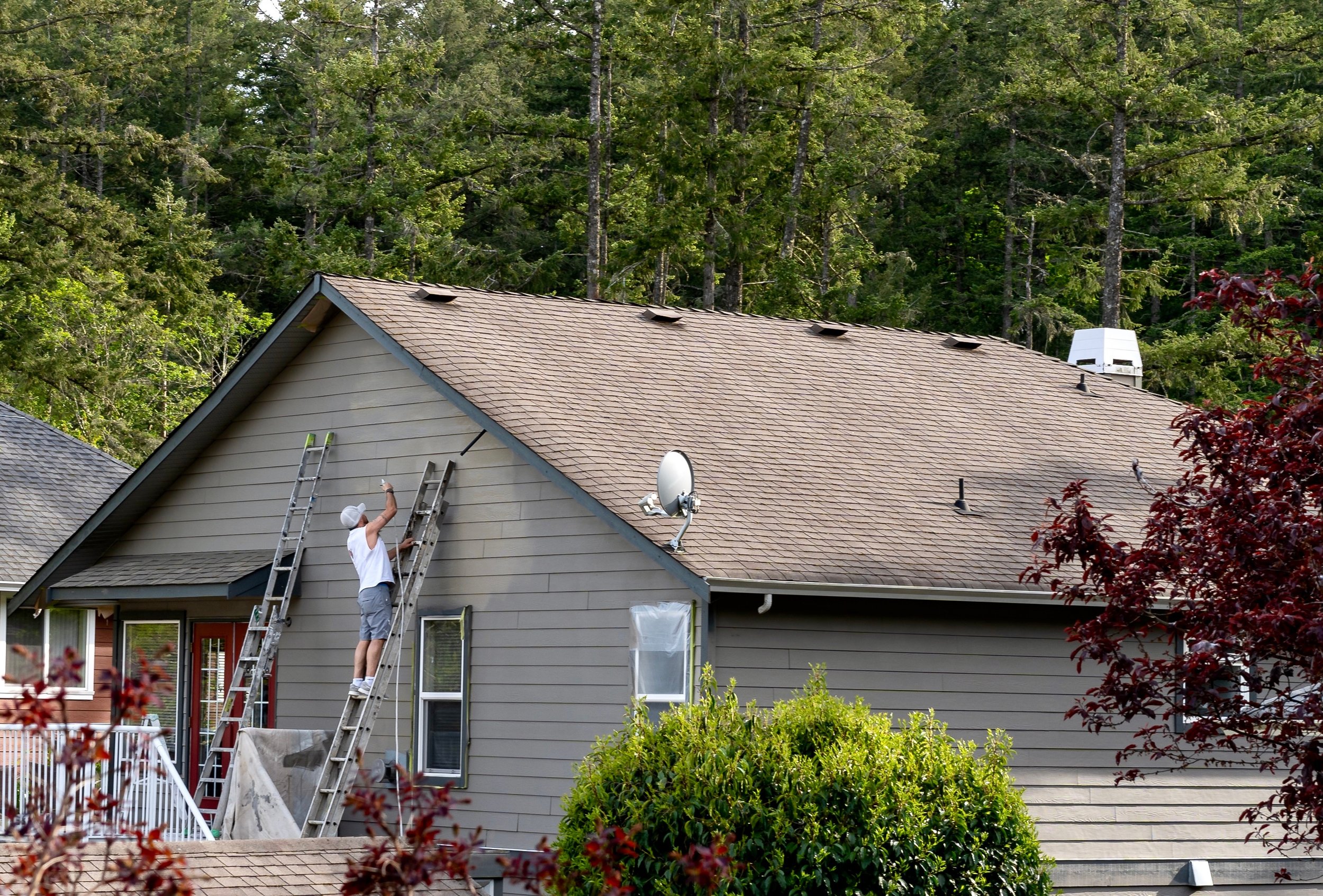
And once you have picked your color, execution matters just as much as the palette. Shine Time’s exterior painting process emphasizes power washing, scraping, sanding, caulking, masking, cleanup, and a final walkthrough because a quality exterior paint job starts with a clean, properly prepared surface. That lines up with broader manufacturer guidance as well: Sherwin-Williams describes exterior paint as designed for lasting results, and Benjamin Moore says high-quality exterior paint provides durability and protection while products such as Regal Select Exterior resist fading, cracking, peeling, and mildew in humid conditions. The right color gets attention, but the right prep is what helps it last.
If you are refreshing a single-family home, preparing a property for market, or updating a residential portfolio, the best 2025 exterior colors all have something in common: they feel warm, intentional, and easy to live with. Warm earthy clay, muted sage green, desert terracotta, soft warm white, and bold charcoal blue each bring a different personality, but all of them line up with where residential color was heading in 2025: away from flat, chilly neutrals and toward colors with more depth, comfort, and staying power.
At Shine Time, we work with homeowners and property managers across Virginia Beach and Hampton Roads, offering turn-key residential painting and exterior cleaning services designed to improve curb appeal and deliver a lasting finish. Our residential services include painting and staining alongside power washing and related exterior care, and our team emphasizes professional prep, customer satisfaction, and free quotes for residential and commercial work. If you are ready to refresh your home’s exterior, request a free quote and let our team help you choose a color palette that will make your property stand out for all the right reasons.